heartbeat
what is heartbeat?
Creators are often overwhelmed with starting and maintaining engaged communities for their cohort-based courses, hobby groups, or other online spaces.
Heartbeat gives creators the tools to easily run personalized, monetized communities with conversations, events, and content.
As the founding designer, I handled everything design. Heartbeat co-founder, Mayhul Arora, handles the engineering. The resulting component library is a result of our interwoven efforts.
This was also a personal labor of love bringing Heartbeat closer to a systematic way of handling design.
results
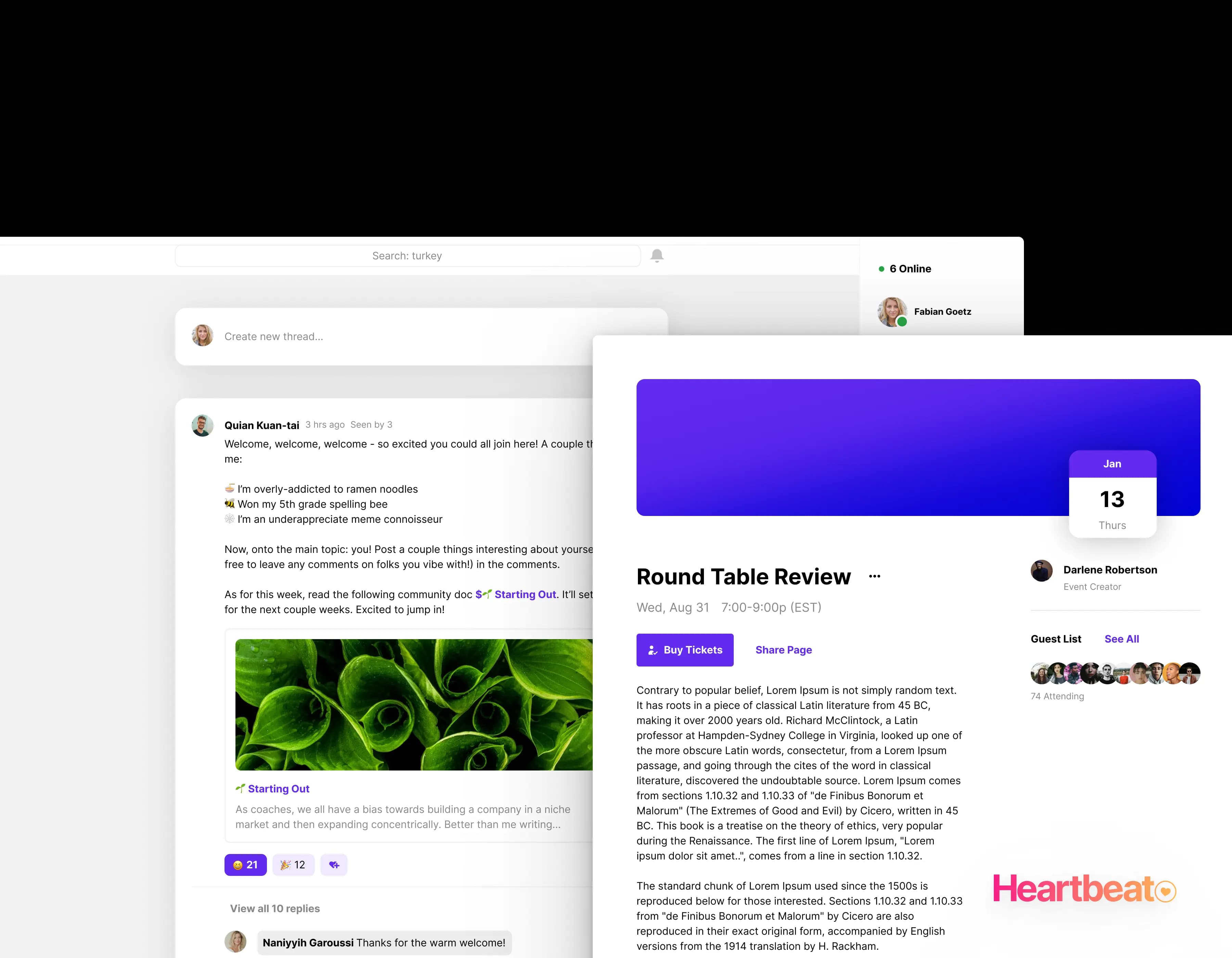
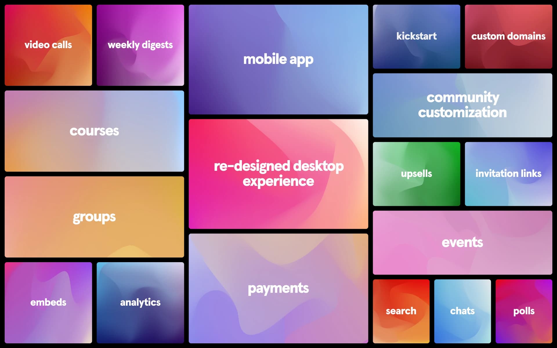
Our component library enabled us to ship features and requests with speed and accuracy. These features ranged from hosting full courses to handling payments, all the way to creating and hosting events - everything budding community admins needed to get a community running, engaged, and monetized.
These ultimately contributed to our company's growth by growing our community count by 40x and facilitating community payments.
constraints
Two foundational constraints shaped the look and feel of our design system: personalization and friendliness.
Heartbeat aims to be a fully user-customized platform, with custom domains, branding, and colors. Primitives are often color agnostic and lack an opinionated Heartbeat branding, instead opting to emphasize each community's branding.
Both community admins and their members prefer friendliness and ease of use over information density - as a result, our components are generally larger and rounder.
Challenges
A problem we faced early on was users getting confused with all the different tools and their own slightly different design patterns. Each section of our all-in-one product had different interaction and navigation patterns. This problem was only exacerbated by more disparate patterns on mobile.
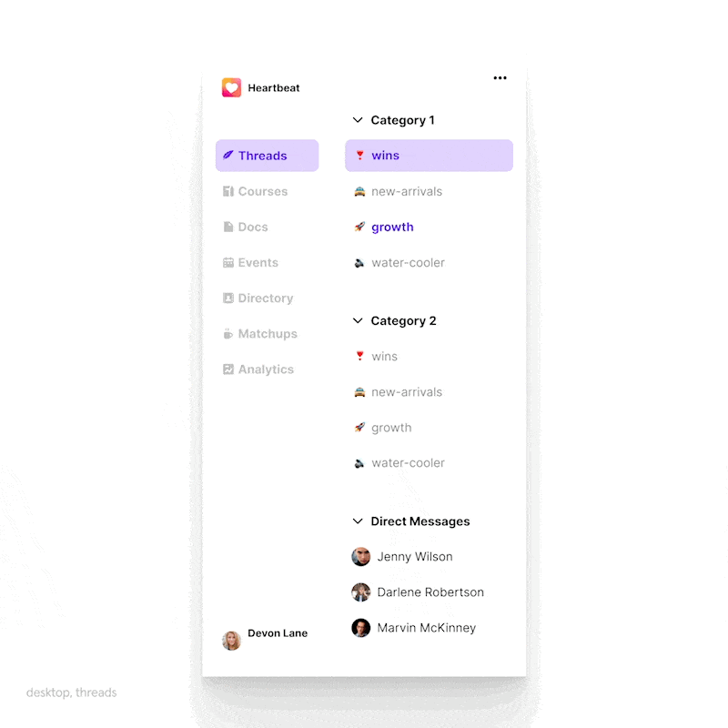
The component library standardized our different product sections. these included primitives themselves as well as patterns when creating entities like events, docs, or threads. The introduction of new embed components also helped users flow from one section of the product to another seamlessly.
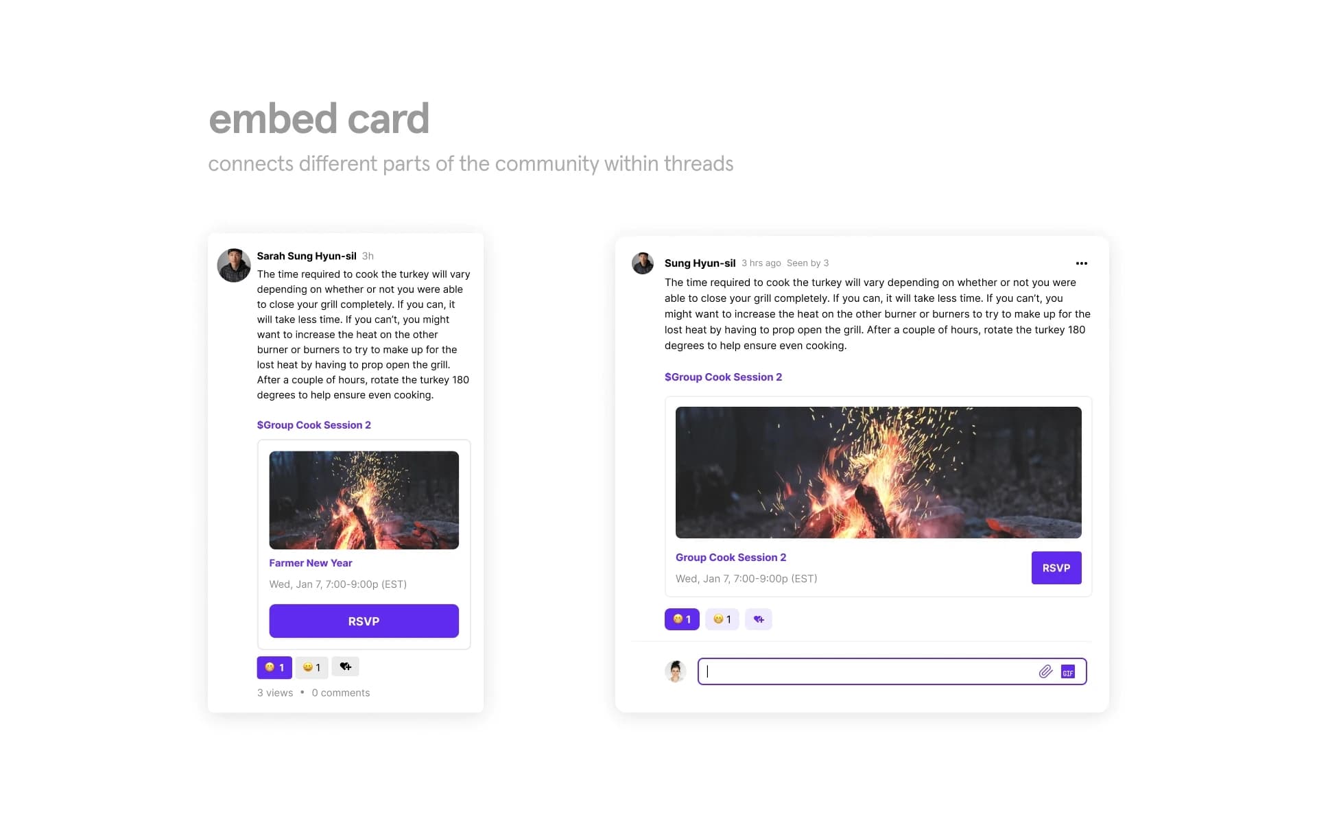
Documentation
From pretty early on, I was interested in a written design history of an evolving system. I was learning a lot - mostly through failures, and it felt really important to record how I was changing how I thought about our design system.
Below is an adapted internal doc written in early 2022, talking about strategies for how granular we get with components and their associated variants in Figma.
avoiding figma complexity
In the process of building our component library, I've found overly complex components and variants take more time to maintain and use. In time, these components stop being used and fall out of maintenance. This doc lists some general rules to avoid this situation to create tidy, efficient, and easy-to-maintain components.
Before we even talk about the components themselves, it's important to note how components get used in figma (as opposed to how they might be used and configured in code.) I find figma is most efficient in a “top-down” style. Assuming you already have pre-made components, this means you generally configure from parent layers downwards until you get to the lowest layer objects. This is for several reasons:
- it's generally easier to select and manage parent layers than child layers
- lack of visibility into nested subcomponents and all their states/variants
- designers are more inclined to think this way
Consider a standard workflow (given that you're using pre-made components): you insert a larger component, swap variants on the component, change variants on subcomponents to properly convey state, then modify text. I personally conceptualize this as three types of components:
primitives
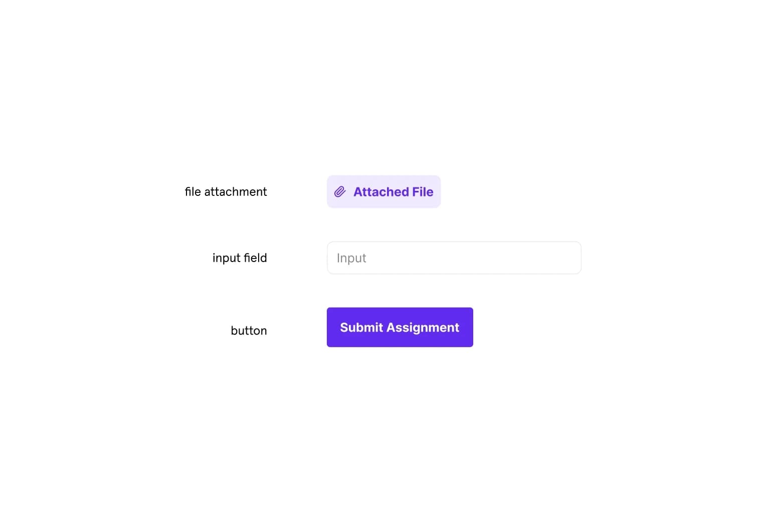
Component primitives are the smallest atoms of our library and are essential for scaling updates and attaching interactions. examples of primitives, like buttons, input fields, or tags.
while we generally want to avoid excessive variants on any component, it's better to do it on increasingly lower levels. this is because efficiently built higher-level components (collections of primitive components) use correct variant instances of primitives, capturing the majority of possible component states in a batched format.
as primitives sit at the lowest levels, variant/property messes are mostly obscured in the actual use of the component. see our dropdown component: all of our variant complexity is baked within the dropdown item level, not the dropdown itself. this also makes prototype interactions much simpler to implement.
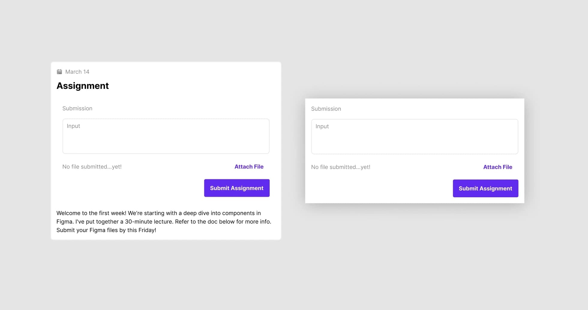
Top level components
Top level components are collections of larger subcomponents, like the thread component or the lesson component.
I generally try to be pretty sparse with variants here on this high of a level. it's generally pretty handy to have a couple of toggles, but try to avoid handling all component states on this high of a level.
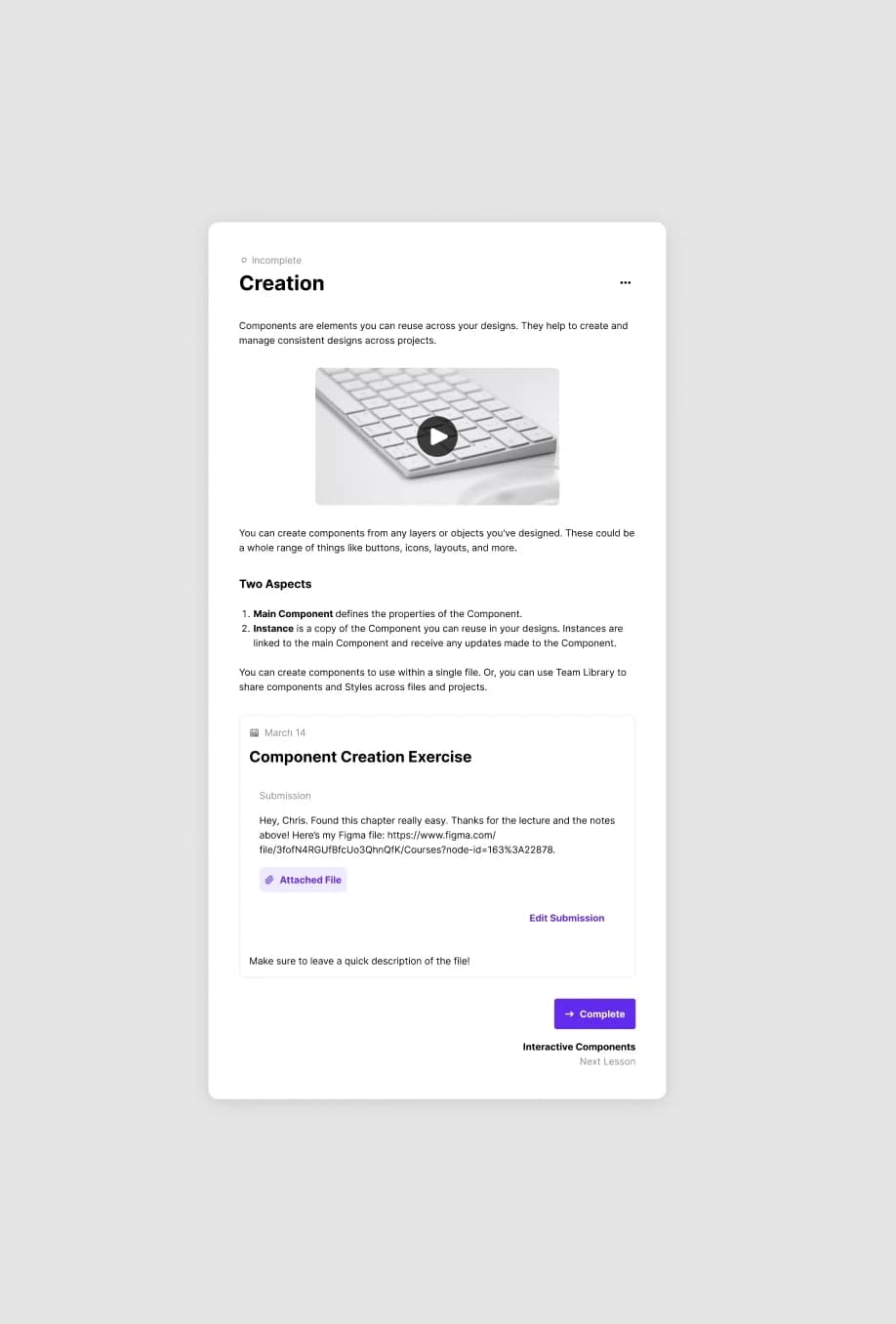
Subcomponents
subcomponents are really useful because they allow for a simplistic variant structure at our top level component, while all possible states a component can be captured by subcomponents that are exactly one level under.
however, when we nest even further subcomponents into those, we may be causing ourselves more harm. see above for an example. the resulting nesting structure looks like lesson → assignment → submission, which leads to over-complication.
it becomes confusing to figure out where the variant or state controls for a subcomponent are stored if there are multiple levels of control to a single one. this also makes updating subcomponents more complicated in the case of specific state changes.
takeaway
set up your variants to be fully encompassing at the primitives level, then take care of component-specific states at the highest or second-highest levels. if you focus on these two first, you shouldn't need to create further subcomponents. the resulting components created should be cleaner, more understandable, more usable, and easier to maintain.