heartbeat search
(Adapted from a Heartbeat blog post at the time of our Search feature release in March 2022.)
At Heartbeat, search was by far our most requested feature - especially after communities began growing faster than we had expected. Admins were digging through more and more content and new members didn't know where to start looking.
three considerations
First, we knew it had to appeal to both power and first-time users. This meant accommodating cognitive differences in users (memory of shortcuts, familiarity, and user mental models) and preferred interaction methods (heavier use of keyboard inputs by power users vs use of clickable UI elements).
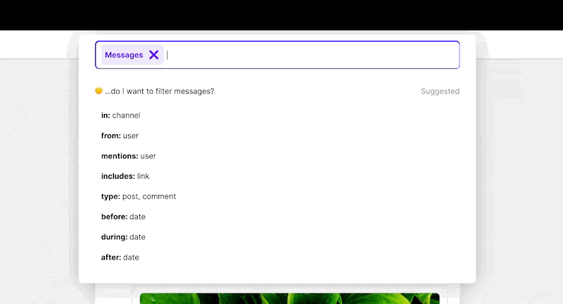
Next, we leaned heavily into search filtering. Search modifiers in some of our favorite products felt incredible to use but some had a steep learning curve. Our goal was to make the process of crafting a query powerful and efficient - but also easy to navigate.
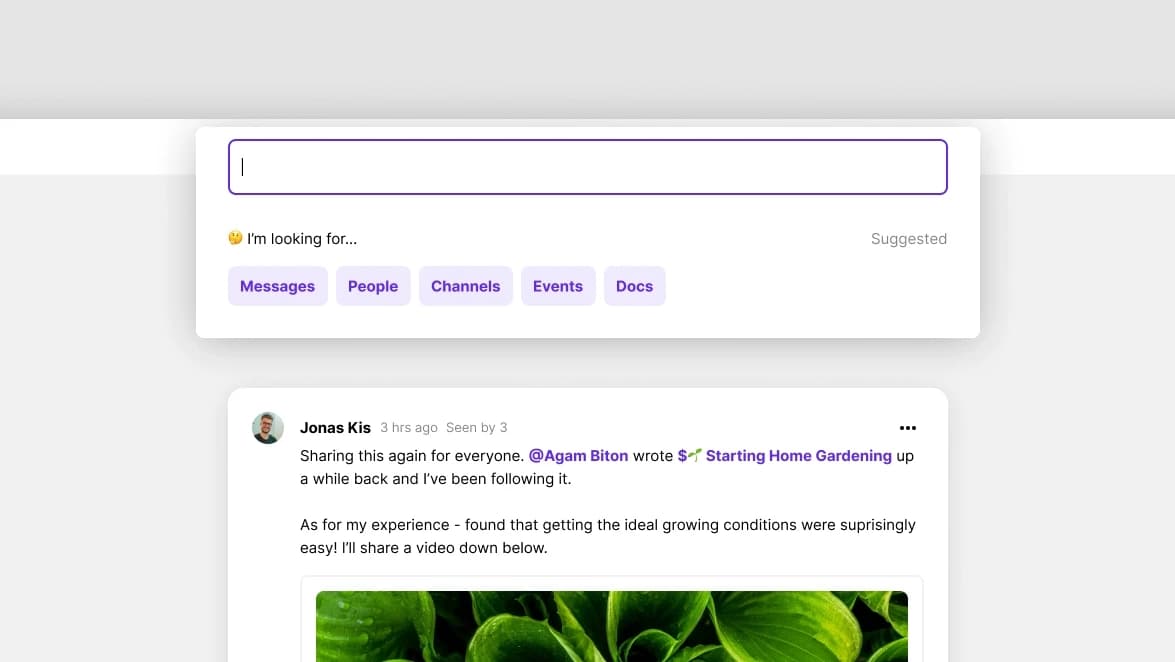
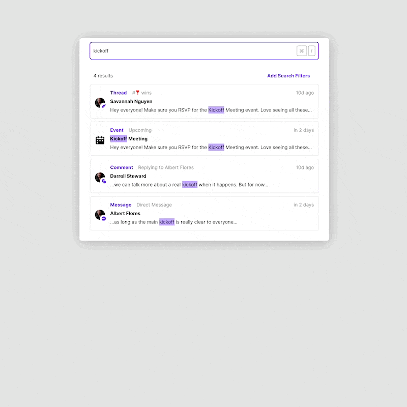
To complete the search experience, we needed to make results easily scan-able. As an all-in-one tool, we knew queries would surface a variety of entities including threads, DMs, events, docs, and people within communities - and users would need to quickly sort these with a limited view.
early looks
We started by looking at modern search patterns, particularly ⌘K and ⌘/ menus. Early on, we experimented with having both: a ⌘K menu that specifically navigated between higher level entities in Heartbeat (navigating between channels, events, or docs) and then a separate ⌘/ menu for finding things (threads, keywords, people).
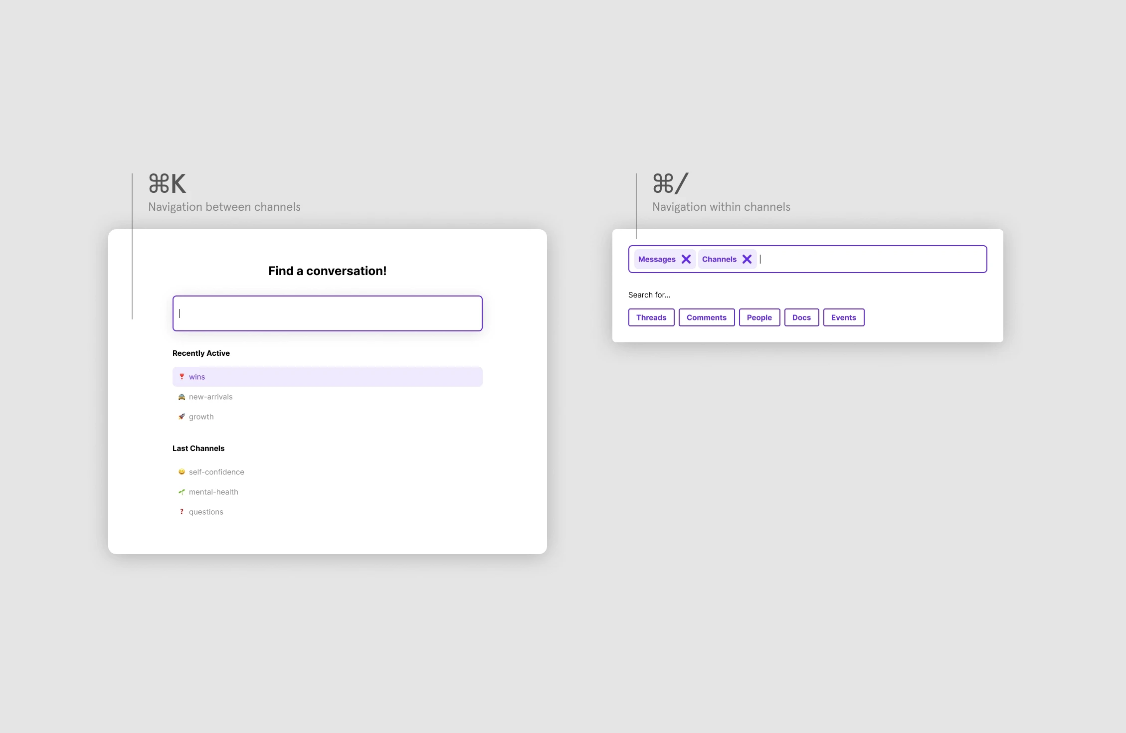
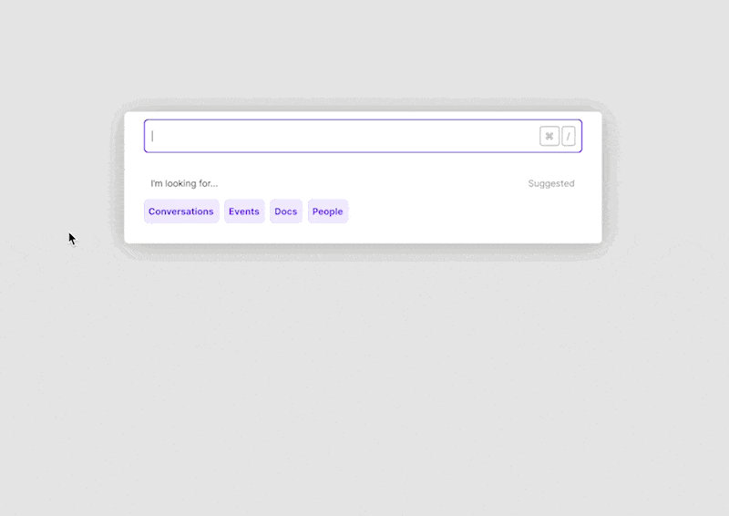
But having two separate menus became complicated for users who had to learn the limits of each menu. For non-shortcut key users, we risked even more confusion by potentially having two apparent “search” bars present on the screen at the same time. Because of these drawbacks, we opted for a single universal search.
Creating a guided experience
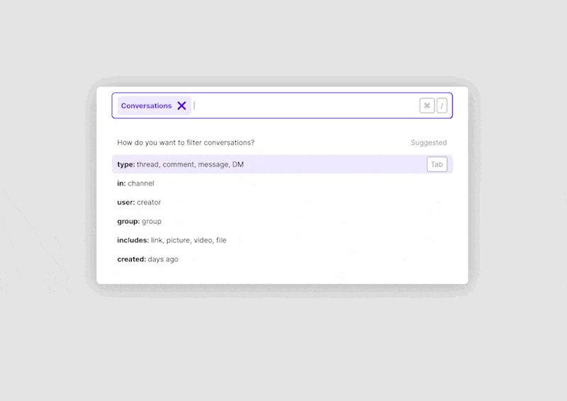
To address the additional noise, we spent time refining search filters. While many apps list search filters in a separate advanced search mode, we wanted to go a step further for our users.
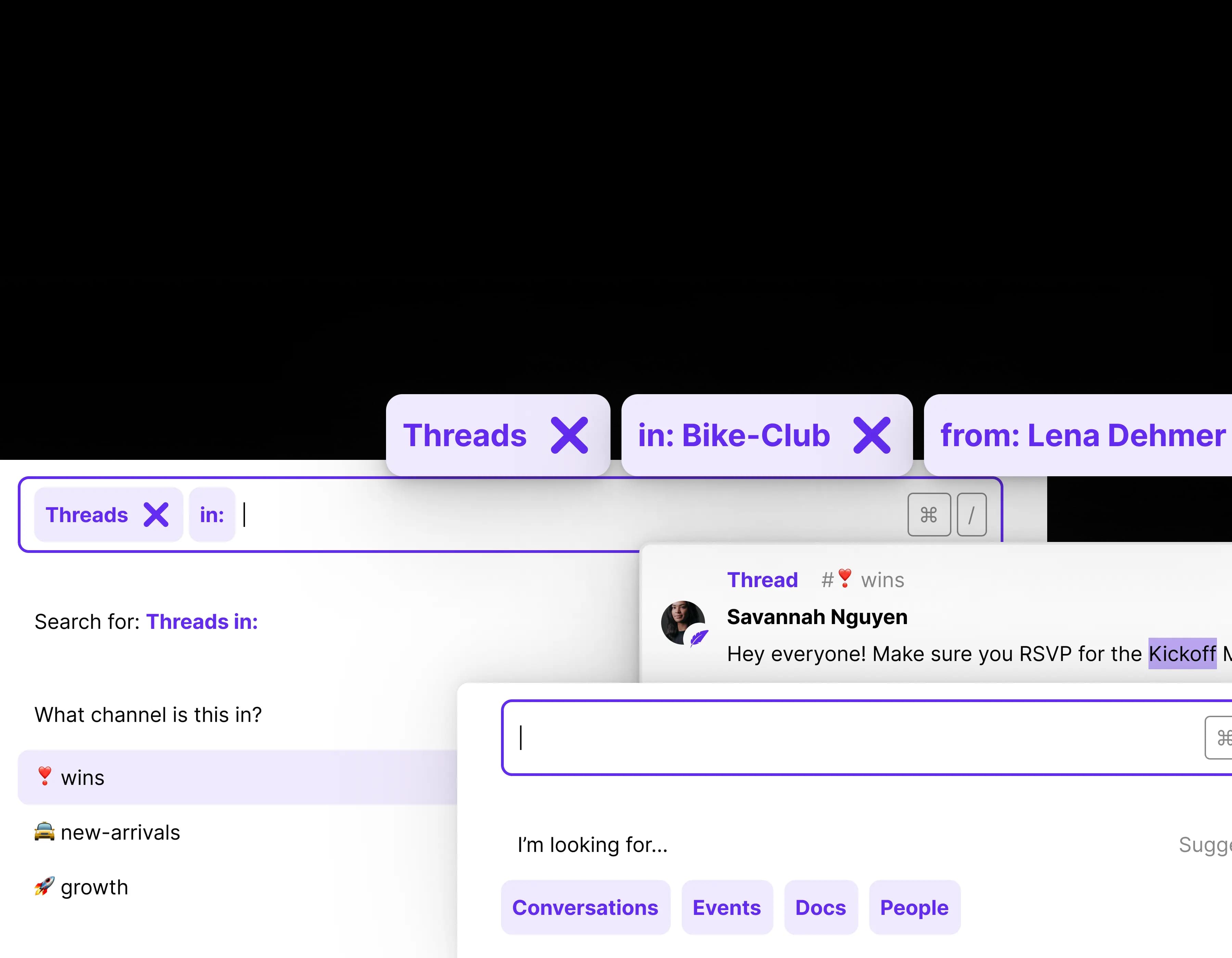
Our search provides guides during the query crafting process. Entering each search filter reveals contextually relevant search filters.
On the other hand, we wanted to make sure that this wasn't a completely on-rails experience. Users were never forced to complete search filters. They could ignore suggestions at any stage in the process or abandon incomplete queries and still complete queries. None of our search filters were dependent on another and could be entered in any order within the query. Users could also add multiple search filters of the same type - resulting in "OR" logic.
Search filters could be added even after an initial query was made - especially useful if we returned an abundance of results. This would lead them back to the same guided search experience.
Input details
Satisfying both power users and average users of Heartbeat meant refining the search experience for 3 different input modalities: mouse-first, keyboard-first, and mixed. We used search tags as a unifying component.
For mouse users, we allowed users to click through the search modifier creation without ever needing to touch the keyboard. Search tags could be removed at any time.
For keyboard users, we used colons to complete search filter terms and insert an inline search tag. We also allowed the use of arrow keys to cycle through search modifier suggestions, Tab for auto-completion, and the inclusion of shortcut key indicators.
Ranking search results
From the start, search weighting was an obvious technical challenge with all of the different entities within Heartbeat. Would we prioritize an event over a thread, given both returned the same keyword match? A DM from seven days ago, or a comment created seven minutes ago?
Working with Mayhul, Heartbeat co-founder and engineer, made it easy. While designers enjoy the challenge of "solo-ing" problems like these, there are often missing technical context that complicates design-eng collaboration. Playing with the API early on and regularly chatting between iterations with Mayhul surfaced a majority of the design considerations we ultimately ran with.
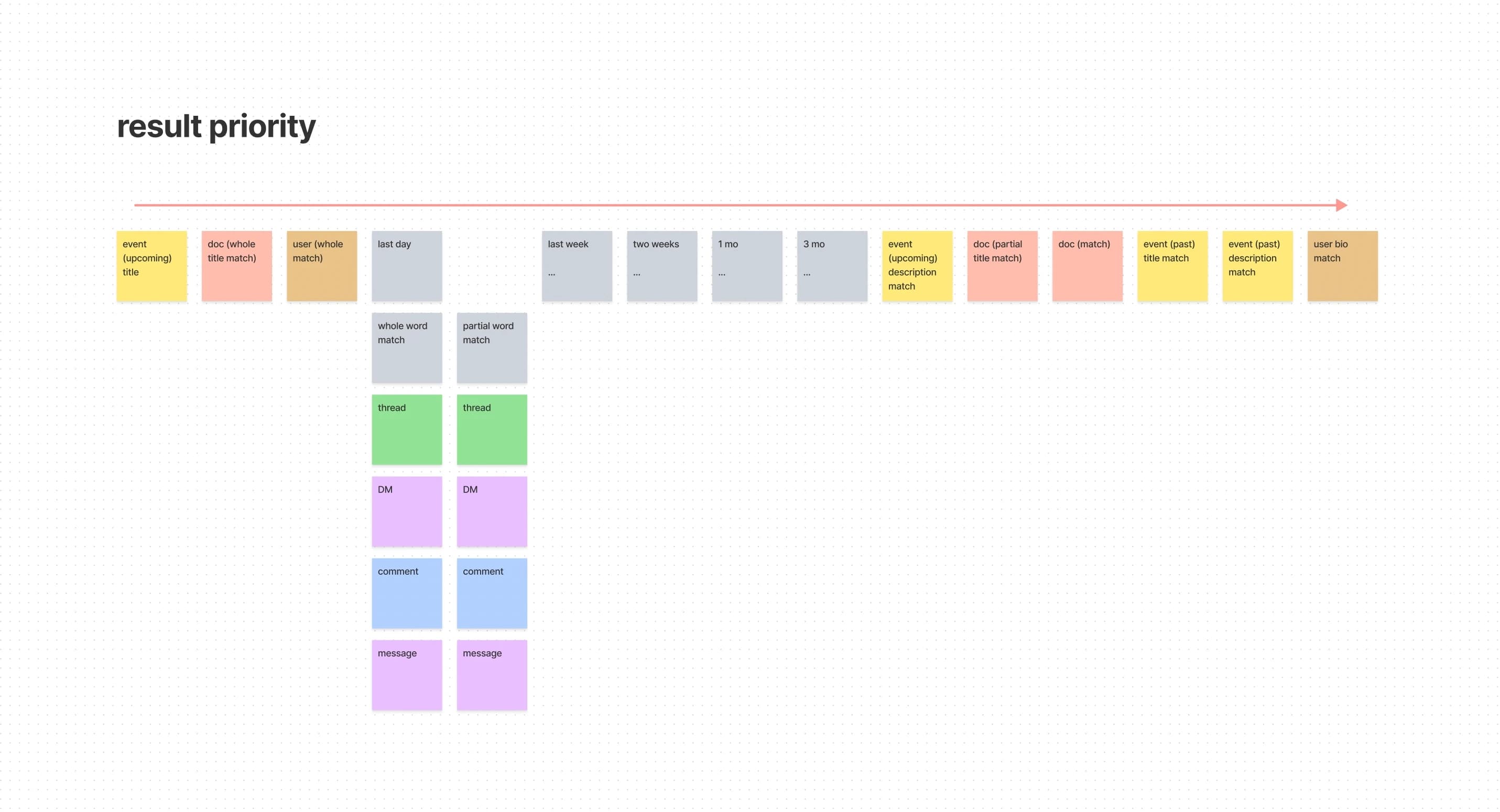
Our sorting was based largely on entities (e.g. weighting an event against a DM) but this wasn't enough on its own; time-sensitive items like upcoming events, threads, and DMs to be more visible. Older communities, for example, built up tons of past events that could dominate search results.
Sorting on a combination of entity-based and time-sensitive factors meant upcoming events, threads in the last 7 days, or DMs within the last 2 weeks were relatively high. Other entities like documents created in the last 30 days (largely static content) were ranked much lower.
The result was a search weighting system that returned more relevant, higher-value results. Further improvements here are still to come - weighting based on relevancy to specific members and the popularity of content within a community.
What's next?
Buildup of content is a problem that we recognize is bigger than just search. We're interested in continuing to ship features that help discoverability of high-value content within communities. But as for now, we're excited to see users finally search for content within their community - even as communities continue to grow.